Background
As of this week, Piet has a new API for creating text layout objects. This supports basic multi-line rich text, and has implementations that work on windows (via DirectWrite) and macOS (via CoreText). Linux support is currently limited by the fact that we’re still using the Cairo ‘toy text’ API; we will get a proper implementation there at some point.
In this post I would like to go over a few particular aspects of this API, and touch briefly on the constraints that led us to these decisions.
To get us started, here is what it looks like to create a text layout using this API:
static TEXT: &str = "Philosophers often behave like little children who \
                     scribble some marks on a piece of paper at random and \
                     then ask the grown-up 'What's that?'";

const RED: Color = Color::rgb8(255, 0, 0);
const BLUE: Color = Color::rgb8(0, 0, 255);

// text_factory is some type that fulfills piet's Text trait
let serif = text_factory.font_family("Georgia").unwrap_or(FontFamily::SERIF);

let sans = text_factory
    .font_family("Helvetica")
    .or_else(|| text_factory.font_family("Arial"))
    .unwrap_or(FontFamily::SANS_SERIF);

let layout = text_factory
    .new_text_layout(TEXT)
    .max_width(200.0)
    .default_attribute(serif)
    .default_attribute(TextAttribute::FontSize(12.0))
    .range_attribute(..13, TextAttribute::ForegroundColor(BLUE))
    .range_attribute(..13, TextAttribute::FontSize(24.0))
    .range_attribute(14..19, TextAttribute::Italic(true))
    .range_attribute(30.., FontWeight::NORMAL)
    .range_attribute(31..47, TextAttribute::FontSize(8.0))
    .range_attribute(60..70, sans.clone())
    .range_attribute(60..70, FontWeight::BLACK)
    .range_attribute(90..100, sans)
    .range_attribute(90..100, FontWeight::LIGHT)
    .range_attribute(90..100, TextAttribute::ForegroundColor(RED))
    .range_attribute(118..126, TextAttribute::Underline(true))
    .range_attribute(128..140, TextAttribute::Italic(true))
    .range_attribute(135..140, FontWeight::BOLD)
    .build()?;
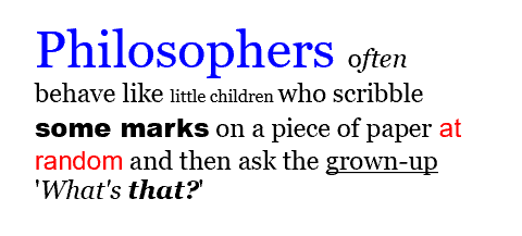
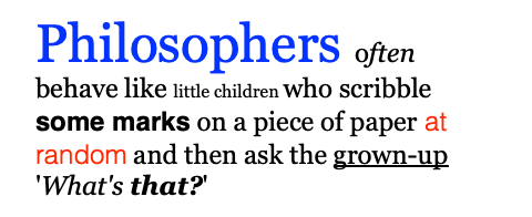
Drawing this layout produces the following output on Windows and macOS:
Windows:
macOS:
A brief aside on design and development cycles
One of the guiding principles behind Piet/Druid (and related projects) is the idea of managing complexity by working iteratively, starting with the bare minimum functionality and then expanding that scope slightly with each pass. In this way, we keep the work in any given cycle from being too overwhelming, and we can apply lessons learned in one cycle to planning the next.
This approach is especially important in complex projects, where arriving at a final design will necessarily require wandering the design space. By keeping scope limited, we are able to avoid the situation where a constraint discovered late in the design process requires us to throw away a large chunk of finished work.
Goals
The first cycle of work on text in Piet was intended to be absolutely minimal: it supported laying out a single line of (latin extended) text using a single font face and a single size. This doesn’t give you much, but it provides the basics for simple UIs, with buttons, labels, and text fields; the things that were necessary in order to demonstrate the viability of Druid.
The goal for this cycle of text work is to expand on that, and offer multi-line rich text, with support for custom fonts and basic attributes such as text alignment. A more concrete expression of this goal is that it should be possible, with Piet, to build a code editor with syntax highlighting. This should support the majority of use-cases; you won’t be able to build a word processor, but you can build most simple apps.
This still leaves lots of things out of scope: we are not (in this cycle) going to support BiDi, or wrapping around arbitrary paths, or customizing the font fallback stack, or modifying line height or toggling OpenType features or any number of other ‘advanced’ text features; we would just like to support the smallest number of features that supports the major use-cases of a UI toolkit.
The API
The text API exposed by Piet was not chosen because it is the best API we can imagine, but because it is an API that we can reasonably implement in both CoreText and DirectWrite. It has several slightly strange elements; these are generally an attempt to find the common ground between these two different APIs.
Fonts
There is a significant distinction between how DirectWrite and CoreText represent fonts when generating layouts. In CoreText, you deal with concrete fonts. To assign a font to a layout, you first have to get the specific CTFont that you want to use. This is an object that refers to a specific font face, at a specific point size; for instance, Helvetica Neue UltraLight Italic, at 16 points. Importantly, you need to know the desired weight (light, normal, bold, etc.) as well as the desired style (italic or normal) in order to retrieve the desired font object.
The DirectWrite API that we want to use for layout objects (IDWriteTextLayout) does not deal with concrete fonts; you separately set the font family, the weight, the style, and the point size, and then DirectWrite handles the work of resolving those settings to the concrete font objects for you. Lets say you would like to create a text object that uses Helvetica Bold Italic at 24 points, on both platforms. On the mac, you would end up with something like,
// this will crash if the font doesn't exist
let boldOblique = NSFont(name: "Helvetica-BoldOblique", size: 24.0)!
let attributedString = NSAttributedString(string: "A quite important message.",
                                          attributes: [.font: boldOblique])
let framesetter = CTFramesetterCreateWithAttributedString(attributedString)
// .. now use the framesetter to create a frame
and on windows you would end up up with something like:
IDWriteTextFormat* pTextFormat_;
hr = pDWriteFactory_->CreateTextFormat(
    // zero guarantee that this exists; the platform will fallback for us
    L"Helvetica",
    NULL,
    DWRITE_FONT_WEIGHT_BOLD,
    DWRITE_FONT_STYLE_OBLIQUE,
    DWRITE_FONT_STRETCH_NORMAL,
    24.0f,
    // forgive me
    L"en-us",
    &pTextFormat_
);
// now use the format object to create an IDWriteTextLayout object
In Piet, we split the difference. Instead of working directly with font objects (which aren’t usable in DirectWrite unless you’re dealing with glyph runs) we work with font families; but instead of a font family just being a string that may or may not correspond to something that exists, a Piet FontFamily represents a family that is known to exist on the system. Piet also exposes a number of generic font families; these correspond to the generic families in CSS (“serif”, “sans-serif”, “monospace”, et al.) and are our recommended default way of choosing a font; with these generic families we can do our best to choose an appropriate high-quality font for the current system.
// A concrete font family: this is `Some` only if a font with the family
// "Helvetica" exists on this machine
let family: Option<FontFamily> = text_factory.font_family("Helvetica");
// A generic font family; this always works
let system_ui = FontFamily::SYSTEM_UI;
Custom fonts
The new API also allows you to load custom fonts. You load a font by passing the raw bytes to the load_font method; on success it returns a FontFamily object that you can use like any other.
Range attributes
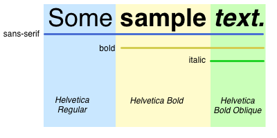
Allowing font size, family, weight and style to be set independently works naturally with DirectWrite, but complicates the mac implementation. Take the following example:
TextLayoutBuilder::new("Some sample text.")
  .range_attribute(.., FontFamily::SANS_SERIF)
  .range_attribute(4.., FontWeight::BOLD)
  .range_attribute(10.., TextAttribute::Italic(true))
  .build();
And this should end up producing something like:
The problem here is that we can’t construct our font objects until we have all of the possible attributes for a given region of the string. The simplest API would be one that accepted arbitrary attributes in any order, stored them all, and then translated them into a format the platform understood when .build() is called.
This complicates our implementation, however, and involves us to hold onto a bunch of intermediate state when we would prefer to just pass things through to the platform as transparently as possible. To make this easier, this API comes with a condition: range attributes must be added in non-decreasing start order. This means that whenever you add a new attribute, we know that everything up to the start of the new range will not change, and we can go ahead and resolve attributes up to that point with the system.
Default attributes
Another complication with range attributes is illustrated with the following example:
TextLayoutBuilder::new("Some sample text.")
    .range_attribute(.., FontWeight::LIGHT)
    .range_attribute(4..10, FontWeight::BOLD)
    .build();
What is the weight for the range 10..? You would probably expect it to be FontWeight::LIGHT. To implement this, though, we would have to maintain a stack (or an interval tree or some other data structure) for all of our attributes. Instead we choose to keep the implementation simple, at the cost of certain constraints on the API itself. In this case, we do not support ‘memory’ of previous ranges of a given attribute; if you change the text size for range 10..50 and then again for range 20..40, we will not remember the initial attribute for range 40..50; you must be explicit.
As a compromise, we allow setting of ‘default’ attributes; for a given attribute you can set the default, which will be used when nothing has been set for that attribute for a given range:
TextLayoutBuilder::new("Some sample text.")
    .default_attribute(FontWeight::LIGHT)
    .range_attribute(4..10, FontWeight::BOLD)
    .build();
Remorse: In hindsight, I think that these two constraints on the API were probably not the best choice; they impose constraints on the user that may not be immediately obvious, and the savings (a handful of allocations, in the general case) seem hard to justify.
Line breaking and truncation
The new layout API supports simple line breaking; you can optionally pass a width constraint when constructing your layout, and we will use that width to break your text up into visual lines. We do not provide customization of this behaviour; you can either opt-in or not, in which case we will only break at newline characters.
We also do not support truncation; for instance, we will not insert an ellipsis or other character if a string does not fit in the provided width. This may change eventually, but currently we feel that if the user would like truncation, they should provide an infinite width and then either clip or fade the result to the desired length on their own, as needed.
Hit-testing and editing features
Piet provides a concise set of APIs to support cursor movement and navigation. This includes methods for mapping a point in the layout to an offset in the text (TextLayout::hit_test_point, used for things like mapping a mouse click to the appropriate text position), for mapping a text position to a point in the layout (TextLayout::hit_test_position, used for determining where to draw the actual cursor on the screen for a given position in the text), and a convenience method for determining the set of bounding rectangles for a given text range (TextLayout::rects_for_range, used for things like drawing selection regions).
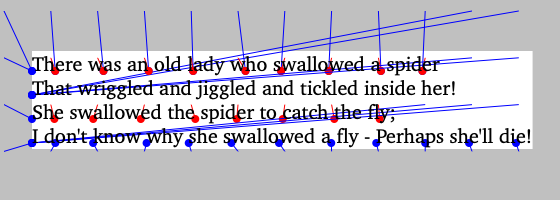
Mapping from points to the appropriate cursor positions
Drawing selection and highlight rectangles
Other miscellaneous fun things:
- synthetic italics: If you specify that a given range should be italicized, and there is no italic or oblique font available in the given family, we will fallback to synthetic italics: essentially applying an affine transform to slant the glyphs.
- text alignment: You can align text to the leading and trailing edges, or you can center or justify it. Leading and trailing depend on the writing direction of the text. DirectWrite supports this natively via the
DWRITE_TEXT_ALIGNMENTenum, but CoreText (viaCTTextAlignment) supports only left/right and ‘natural’ alignment, where ‘natural’ is left in left-to-right scripts and right in right-to-left scripts; in order to make trailing alignment work, we need to determine the writing direction of the script, which we do using the unicode BiDi character tables. - gradient fill: this work regresses functionality that existed previously in piet, which was the ability to apply a gradient fill to text. DirectWrite supports assigning arbitrary brushes for drawing ranges of the string, but CoreText/CoreGraphics only allows the setting of color for ranges; you can draw the entire layout as a gradient mask, but not ranges. In practice, we think this is a tolerable regression.
- variable fonts: this work includes limited support for variable fonts; in particular if a font has a
wghtaxis, we will use it.